Wednesday 30 January 2013

Editing update - 30/1/13 SMART TARGETS


Specific - be specific when setting goals and what you wanna get from it
Measurable - be able to realise when you're achieving them
Achievable - it's actually easy to achieve
Realistic - we can actually do it 
Time-Bound - we have a time to do it by. 

As our group as a four have split into two pairs, we have both looked at each others videos at what they are at at the moment and gave each other targets and opinions on what we can each do to improve or ideas we should think about using the SMART theory.

These are the goals we got from Kirstie & Daniel in the other group - 

Colour on the brightness change, we need to make sure its continued throughout the video so it doesn’t look different

consider putting the 'flashforwards' in black and white. 

Don’t use too many effects


Becky and I looked over SMART and made note of what we need to consider to help us get our editing done as well as our webpage and digi pack

S- when setting goals/the goals set by Daniel and Kirstie make sure we stick to our targets and not go off track.
M- when we have achieved those set targets make sure we tick them off and try to find some more targets
A- make sure everything is achieved and that we are happy with the final products
R- make sure it's doable
T- plan schedule of when to come back in spare time to edit as we have lost time due to exams for other subjects and illness.


Tuesday 15 January 2013

Website development 1

Today I have started on developing my website.  Throughout I have made good and bad decisions and changed ideas etc.  I've tried my best to stick to my original plan of what I wanted my website design to be like from when we did our research and planning.  I used websites such as 'picmonkey.com' the photo editing site and 'urbanfonts.com' to search some different fonts to use.  


 my original logo is the image of the close up of an eye.  During the filming process I took various images of the making character to make sure I had a variety of different images for my digi pack and website.  One of those images was a close up of the main characters eye. I used the website 'picmonkey' to edit the eye image. I experimented with the different tools such as 'crop' and 'effects'.  the effects I used were 'cross process' this gave you the option of the colours green, blue or red.  I chose the blue colour as it fit with my colour scheme I chose from when i was doing my planning and research.  The shadow on the eye (right) works as it fit with my idea of what I wanted my character to be shown as when i designed my Frankenstein even though it doesn't make the eye stand out as much.  To try and make the eye stand out more I used the effect 'focal zoom'.  This lets me focus on the eyeball and have a zoom like effect around the eye zooming onto the eye.  


I then used the website 'urbanfonts' to find a font which matches our genre.  I searched the words 'futuristic' and 'electronic' in the search bar to find different fonts to choose from.  I chose the font 'crash scene' as it is in a lightning style font. From our previous research we used noticed that scientific images sometimes represent the genere, therefore the lightning effect works well.

I then noticed that the font I had chosen was very similar to the font The Prodigy used for one of their fonts.  This is good as it shows that I am having the right ideas to suit my genre.  But then  it could also be a bad thing having the same font as The Prodigy.  But I don't think that this is the worst of my problems as it isn't completely the same as my chosen font.


I had a problem with the colour of the font I chose for my website.  As I am using black background on my website I would have to change the colour of the font to a visible colour when it is on the webpage.  To do this is had to use the tool available on the website which allows you to change the colour of the background of the text and the font. So I changed the background colour from white to black and the font colour from black to white 


I began to experiment with the different colours and fonts I could use for a theme throughout my website design.  I have currently stuck to the basic black and white theme but comparing it to my website design and other parts of research and planning I did such as the mood board I think that I will go on to change it to make sure it fits with the genre Electronica. 


With my website design I tried my best to stick to my plan of the webpage design I did a few weeks back in for research and planning.  As I wanted an eye image for the main attraction on the enter page, I used one of the images I took when I was taking pictures for my digi pack.  I used 'picmonkey' to edit it as much as I could to make it fit well with the design and to still fit with the genre of the artist.  I'm not 100% happy with the image so I am going to be editing it again or I will find an image which isn't copyrighted to replace it. 


Editing Update - 15/01/2013

Thursday 10 January 2013

8/1/13

We have came back from the Christmas break and decided to plan the next few weeks we have of our coursework.  as a group we decided to split into two pairs and edit a video each as having all four of us doing it would be too much and we felt that we wouldn't all be able to get the chance to edit.  myself and Becky decided to go together and Daniel and Kirstie went into their own pair.  I was pleased with this decision as in previous experiences when editing I felt that I didn't really have a chance of editing.

We have watched the the whole of the video through and made a rough not of that about 20 minutes out of the 40 we filmed was use-able for our video.  We noticed that the lighting was quite dark throughout the film but it links with our research.  For example when we were putting our Frankensteins together to show what we would like our character to be like, it fits perfectly as in most of the clips we want to use, one side of the main characters face is in the light whereas the other half is shadowed.  


Wednesday 9 January 2013

9/1/13 Start on editing

Today we started on editing after watching out recorded footage yesterday.  we started off by importing all of the footage into final cut and then downloading our track and then importing that into Final Cut.  We started to put together a rough cut of what we want our opening to be like which was then leading onto the main character.

We used Final Cut to start to put our video together.  I took regular print screens of different things we used in the process of editing which will be able to help us throughout.  The picture below shows that we put our audio into one of the two videos that are shown (left) and edited out parts from that tout down into the 2nd video bar giving them the the advantage of being able to play over anything lower than its self.  We then used the audio bar to play the track from.

We also found a useful thing while editing and that was to make sure that the padlock sign on the audio bar is locked.  This makes it easier for us throughout our editing process as it automatically deletes the audio from the clip we have cut and plays the chosen audio, in this case in which is the song we are using.
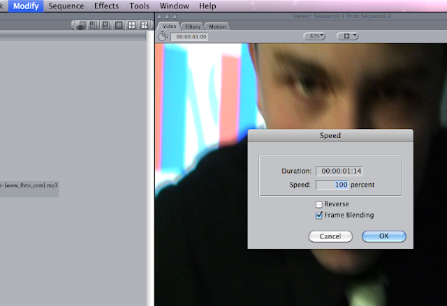
On one of the clips we chose to use for one of the static beats in the beginning of the song was a clip of a light turning on, we wanted it to be the opposite and for the light to be switching off so we reversed the clip.  To do this we went to 'modify' then we clicked on 'speed' which gave us a box appear on the screen as seen below, we ticked the box which says 'Reverse' and then this reversed the clip.  We also chose to change the speed of the clip so it fitted with the 'static beat' therefore we changed the speed to 80 percent.
To cut parts of our whole video of what we recorded, we used 'mark-in and mark-out' to help us with this.  this cuts however long of the clip for you to drag down to the video bars where then I can edit the speed r the length of the clip.
the image below shows that we used both video 1&2 to put our video clips in.  As the idea of the opening of the sing to be 'flashforwards' show you parts of what is to come we decided to used both video bars so for example when the 'static beats' come in the song the short clip shown in V2 appear and go back to what was being shown before in V1 smoothly.