Wednesday 27 March 2013
Tuesday 12 March 2013

Friday 15 February 2013


Digi pack and webpage update
Today is my first lesson back doing my digi pack and website. I have decided that instead of using iWeb I am going to use webs.com. I have chosen to use webs.com because I feel that it is more productive that iWeb and you are able to do more with it. This will help me make my webpage more synergistic.
I have picked up from where i left off which is with the eye idea i have had from the beginning when i started to put down ideas in a mood board and my draw webpage design idea. The image on the left shows Joe's (the actor) eye. I had a few problems with editing it so it was synergistic to my genre but without losing the eye because of the shadow. So I tried to look for some eye images on the internet. This was another problem as most of the pictures on the internet are copyrighted. So I had no choice to take a picture of an eye and edit it myself. I asked my friend if it was ok if I could use an image of her eye and edited it on picmonkey. I edited the picture more than once using different colours for the pupil s so it stood out. I stuck to dark colours and the colours green and blue as those were the main colours I used when I made my mood board.

This is the original picture of my friends eye. I used picmonkey to edit it to be synergistic with my music video and genre. I used the tool's 'Crop' and then 'Holger'
The effect Holger makes the pucture black and white, then you are able to highlight a part of the picture so it has colour on it. in this case I highlighted the pupil so the blue eye colour could come through. To make the edges darker and the pupil a darker colour i used the effect Lomo.


If you compare the picture of the first eye (above) and the second, you can see that the 2nd eye is way more effective. Also the colour makes the website and digipack more synergistic to my music video.


 I noticed that the first edit with my main picture of MAD XIBIT was too light with the colours which meant that it could make my website and Digi pack non synergicstic with the music video. So I Used pick monkey again and used the effects colours and adjusted the brightness and then I used the effect Orton and changed the darkness of the blues.
Thursday 14 February 2013
Digipack analysis

- The first Digi pack I am going to analyse is The Fat of the Land - The Prodigy. I chose this because The Prodigy are part of the electronic genre. I think that this is a good example of a Digi Pack as it represents a lot of different things. It was released in 1997, this was a time when warehouse raves were very popular and drugs such as 'E' were taken. The focal zoom effect used links in with the effect of vision you would get from the drug 'E'. The Prodiy's music was popular in this era and their songs were known to be played in these warehouse raves. The use of the focal zoom effect on their Digi pack would stand out from others in a music shop and be familiar with the young people of the 90s. This could help sell the album.
- The Crab is a juxtaposition as it is small, but is intimidating. It is like a representation of the lead vocalist of The Prodigy, Keith Flint because when Keith performs he has a bizarre way of performing jumping around the stage.

this is Keith Flint performing in the 90s. You can see the similarities between Kieth's body language and the body language of the crab.
This also shows that image is a big thing in The Prodigy's career with his green spikes and dark eye make-up, but because their image is so strong and memorable, they don't need to present themselves on the front cover of the Digi pack.
This also shows that image is a big thing in The Prodigy's career with his green spikes and dark eye make-up, but because their image is so strong and memorable, they don't need to present themselves on the front cover of the Digi pack.

- The second Digipack I am going to analyse is 'Ready for the Weekend - Calvin Harris' I have chosen this Digipack because it is in the genre of electronic but also is a sub genre of pop. You can see this because it has a beauty shot of a female as the main image. The image and the album title is a hegemonic referal to a young woman of today who likes to go out at the weekend and party. The fact she is wearing sun glasses, which are made to stand out in the whole picture gives the impression that she has two sides to her, that maybe she has a more 'wild' side to her when she 'lets her hair down' which links with the album title connoting that she is ready for the weekend.
- The font type is the same as the font on a calculator or a computer. This then links with the Electronic genre. Because the image can lead to the Pop genre, the font used brings back the Electronic image to it.
Editing update - 14/02/13
Today I came back during my lunch time and free period to finish off the editing. When I opened Final Cut and saw that the work Becky and I did yesterday had been wiped. We still do not know how because it was saved several times throughout the day. I tried to get it back with the help from my teacher and we were unable to, so the only option was to start from what needed to be put back in. This meant that I needed to put in all of the clips that were left blank, for example parts of the verses we hadn't done yet and the effects we added throughout the whole video.
When editing yesterday I noticed that I would edit different parts of the track like different sections at different times. I realize that today I just made it more complicated for myself.
When I found out that I had to do the editing what I did yesterday again I felt to give up as I feel that because of lack of communication between me and Becky in the last few days and the problem with this subject clashing with other subjects deadlines that I have put in more effort. After discussing this with Becky we both changed our actions. Because of those problems I felt let down by Becky because I felt as if I was working on my own. I turned to Kirstie and Daniel a lot for help, mainly opinions on what I have done so far and I think that having them as a second opinion helped me a lot through the process of editing.
I got in touch with Becky as soon as possible when I found out that our editing from yesterday had been wiped. I was really pleased with her because even though she was in a lesson at the time she came and spoke to me about it to arrange what we are going to do about the situation. This made me feel more positive about the work and we agreed that I will use that hour she is in a lesson to get started on it being how we left it yesterday and that she was going to come back to media after school to go through it with me. This proved that we were just having problems with communication and that I will make sure that the communication between me and my group partner will be stronger in future.
From working from the beginning of the track going through making sure that the right effects were on each clip and that every clip was in sync with the track was a much easier way of editing it, and the fact that the editing was fresh in our memory from the day before it made it much easier than I expected it to be. Working in this way made the editing of today happen more faster and smoothly than it has before.
final banne design for my Website
I thought that my original logo was too plain for the genre Electronic. I used the software 'picmonkey' to overlap two pictures so the lightning picture I found which didn't have copyright on it have the text I got from urban fonts to give it an effect
Before:

After:

Before:

After:

Wednesday 13 February 2013
Editing Update - 13/02/13
Today my school time table is pretty much a free day other than the two hours in the morning (period 1&2) I have which is media. This is giving myself and Becky the opportunity to finish off our editing. As Becky has a Dance deadline approaching we have agreed that Becky will edit on her own, with me on the Mac next to her while I worked on my Digi Pack and website. This way she will be able to prove that she has had a good amount of time editing as she hasn't been able to put in as many hours as me being tied up with other subjects. Because of this we agreed for her to edit for periods 1,2, break time and 3. I then went on to edit periods 4, lunch, 5 and after school. Myself and Kirstie stayed until 6pm to make sure that I could get everything I can in on the editing.
I am really pleased with the effects I added today.
Before this piece of coursework I never had the chance to learn anything from Final Cut because I had problems with my previous coursework groups. I feel that this time I have learned to become very independent with it, which has helped me a lot on learning how to use the software well. I had the help of Kirstie as she has finished her video with Daniel before us. I really appreciated having Kirstie talk me through different tools and techniques I could use of which I wasn't aware of.

This was one tool I used throughout. Because I am using that shade of blue throughout on different clips. To keep it the same shade of blue and the same effect on those chosen effects I highlighted the clip shown in the right box and went to file and copy. I then highlighted another clip I wanted to have the same effect go to edit and then paste attributes this would then open a box:

You would tick the filters button, and then this would copy the effect into that effect into that clip.
Wednesday 6 February 2013
Editing update 06/02/13
Due to absence, I have been working on my own while editing. I have discussed and made decisions with Becky on what we are planning to do with the rough cut and effects. I have scheduled to come back in my spare time, after school and during school in my free periods as I missed out on a lot of opportunities to edit due to illness. I feel that i have made a big difference to the editing in the past few days as i have been able to edit as much as I can.
Today I came across a problem with the brightness in one of the shots we took. The problem was that the shot (left) was too dark to see the lip synch. To improve this I went to Filters and changed the brightness and contrast so that it wasn't too bright but enough to see that the actor is lip synching. I am aware that that clip will stand out from the rest of the video so I am planning to add an effect to it when i come to adding them.

Throughout editing I had noticed that I kept having the same problem of the clips moving out of synch with the music when I had already placed them there when i was working in-between them. So to remember where it is in synch i put a marker there. This is when i lined up the start of the clip pressed M on the keyboard and a green marker appears on the bar. This made it much easier as i could just highlight the chorus for example and line it up with the marker, and it is in synch again.

Because I have been editing on my own I asked Kirstie from the other half of our group to look over what i have done so far and give me a second opinion about it. I found this useful as she pointed out a very obvious and valid point which has helped me a lot.
As you can see from the first screen shot that is a clip from the beginning of the video. It is a panning clip of the lecture feature with everyone in it. In the second screen shot it shows that just before the first verse i had put in a clip of the lecture theatre with 3 people in it, then a second with everyone in it. Not realising that I have already put a full shot of everyone in the lecture theatre. So, what I am planning on doing to improve this is remove the clip from the second screen shot with 3 people in the lecture theatre, but keep the second where it is full. I am going to put an effect on it, most probably either a slow motion blur one or a flashing one. I think it would be best to go with the slow mo effect as we already have quite a lot of shots where there is a blink effect or sharp blackout effect on it.
1)

2)

Wednesday 30 January 2013
Editing update - 30/1/13 SMART TARGETS


Specific - be specific when setting goals and what you wanna get from it
Measurable - be able to realise when you're achieving them
Achievable - it's actually easy to achieve
Realistic - we can actually do it
Time-Bound - we have a time to do it by.
As our group as a four have split into two pairs, we have both looked at each others videos at what they are at at the moment and gave each other targets and opinions on what we can each do to improve or ideas we should think about using the SMART theory.
These are the goals we got from Kirstie & Daniel in the other group -
Colour on the brightness change, we need to
make sure its continued throughout the video so it doesn’t look different
consider putting the 'flashforwards' in black and white.
consider putting the 'flashforwards' in black and white.
Don’t use too many effects
Becky and I looked over SMART and made note of what we need to consider to help us get our editing done as well as our webpage and digi packS- when setting goals/the goals set by Daniel and Kirstie make sure we stick to our targets and not go off track.
M- when we have achieved those set targets make sure we tick them off and try to find some more targets
A- make sure everything is achieved and that we are happy with the final products
R- make sure it's doable
T- plan schedule of when to come back in spare time to edit as we have lost time due to exams for other subjects and illness.
Tuesday 22 January 2013


Tuesday 15 January 2013
Website development 1
Today I have started on developing my website. Throughout I have made good and bad decisions and changed ideas etc. I've tried my best to stick to my original plan of what I wanted my website design to be like from when we did our research and planning. I used websites such as 'picmonkey.com' the photo editing site and 'urbanfonts.com' to search some different fonts to use.


my original logo is the image of the close up of an eye. During the filming process I took various images of the making character to make sure I had a variety of different images for my digi pack and website. One of those images was a close up of the main characters eye. I used the website 'picmonkey' to edit the eye image. I experimented with the different tools such as 'crop' and 'effects'. the effects I used were 'cross process' this gave you the option of the colours green, blue or red. I chose the blue colour as it fit with my colour scheme I chose from when i was doing my planning and research. The shadow on the eye (right) works as it fit with my idea of what I wanted my character to be shown as when i designed my Frankenstein even though it doesn't make the eye stand out as much. To try and make the eye stand out more I used the effect 'focal zoom'. This lets me focus on the eyeball and have a zoom like effect around the eye zooming onto the eye.
I then used the website 'urbanfonts' to find a font which matches our genre. I searched the words 'futuristic' and 'electronic' in the search bar to find different fonts to choose from. I chose the font 'crash scene' as it is in a lightning style font. From our previous research we used noticed that scientific images sometimes represent the genere, therefore the lightning effect works well.


I had a problem with the colour of the font I chose for my website. As I am using black background on my website I would have to change the colour of the font to a visible colour when it is on the webpage. To do this is had to use the tool available on the website which allows you to change the colour of the background of the text and the font. So I changed the background colour from white to black and the font colour from black to white


I began to experiment with the different colours and fonts I could use for a theme throughout my website design. I have currently stuck to the basic black and white theme but comparing it to my website design and other parts of research and planning I did such as the mood board I think that I will go on to change it to make sure it fits with the genre Electronica.

With my website design I tried my best to stick to my plan of the webpage design I did a few weeks back in for research and planning. As I wanted an eye image for the main attraction on the enter page, I used one of the images I took when I was taking pictures for my digi pack. I used 'picmonkey' to edit it as much as I could to make it fit well with the design and to still fit with the genre of the artist. I'm not 100% happy with the image so I am going to be editing it again or I will find an image which isn't copyrighted to replace it.


Thursday 10 January 2013
8/1/13
We have came back from the Christmas break and decided to plan the next few weeks we have of our coursework. as a group we decided to split into two pairs and edit a video each as having all four of us doing it would be too much and we felt that we wouldn't all be able to get the chance to edit. myself and Becky decided to go together and Daniel and Kirstie went into their own pair. I was pleased with this decision as in previous experiences when editing I felt that I didn't really have a chance of editing.
We have watched the the whole of the video through and made a rough not of that about 20 minutes out of the 40 we filmed was use-able for our video. We noticed that the lighting was quite dark throughout the film but it links with our research. For example when we were putting our Frankensteins together to show what we would like our character to be like, it fits perfectly as in most of the clips we want to use, one side of the main characters face is in the light whereas the other half is shadowed.
We have watched the the whole of the video through and made a rough not of that about 20 minutes out of the 40 we filmed was use-able for our video. We noticed that the lighting was quite dark throughout the film but it links with our research. For example when we were putting our Frankensteins together to show what we would like our character to be like, it fits perfectly as in most of the clips we want to use, one side of the main characters face is in the light whereas the other half is shadowed.
Wednesday 9 January 2013
9/1/13 Start on editing
Today we started on editing after watching out recorded footage yesterday. we started off by importing all of the footage into final cut and then downloading our track and then importing that into Final Cut. We started to put together a rough cut of what we want our opening to be like which was then leading onto the main character.
We used Final Cut to start to put our video together. I took regular print screens of different things we used in the process of editing which will be able to help us throughout. The picture below shows that we put our audio into one of the two videos that are shown (left) and edited out parts from that tout down into the 2nd video bar giving them the the advantage of being able to play over anything lower than its self. We then used the audio bar to play the track from.

We also found a useful thing while editing and that was to make sure that the padlock sign on the audio bar is locked. This makes it easier for us throughout our editing process as it automatically deletes the audio from the clip we have cut and plays the chosen audio, in this case in which is the song we are using.
 On one of the clips we chose to use for one of the static beats in the beginning of the song was a clip of a light turning on, we wanted it to be the opposite and for the light to be switching off so we reversed the clip. To do this we went to 'modify' then we clicked on 'speed' which gave us a box appear on the screen as seen below, we ticked the box which says 'Reverse' and then this reversed the clip. We also chose to change the speed of the clip so it fitted with the 'static beat' therefore we changed the speed to 80 percent.
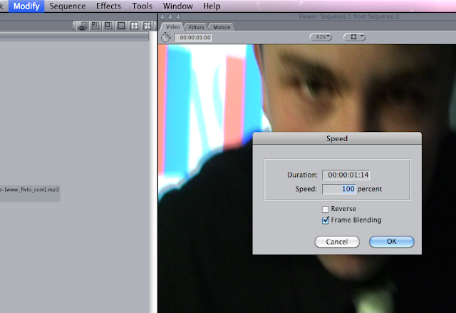
To cut parts of our whole video of what we recorded, we used 'mark-in and mark-out' to help us with this. this cuts however long of the clip for you to drag down to the video bars where then I can edit the speed r the length of the clip.
 the image below shows that we used both video 1&2 to put our video clips in. As the idea of the opening of the sing to be 'flashforwards' show you parts of what is to come we decided to used both video bars so for example when the 'static beats' come in the song the short clip shown in V2 appear and go back to what was being shown before in V1 smoothly.

We used Final Cut to start to put our video together. I took regular print screens of different things we used in the process of editing which will be able to help us throughout. The picture below shows that we put our audio into one of the two videos that are shown (left) and edited out parts from that tout down into the 2nd video bar giving them the the advantage of being able to play over anything lower than its self. We then used the audio bar to play the track from.

We also found a useful thing while editing and that was to make sure that the padlock sign on the audio bar is locked. This makes it easier for us throughout our editing process as it automatically deletes the audio from the clip we have cut and plays the chosen audio, in this case in which is the song we are using.


To cut parts of our whole video of what we recorded, we used 'mark-in and mark-out' to help us with this. this cuts however long of the clip for you to drag down to the video bars where then I can edit the speed r the length of the clip.


Subscribe to:
Posts (Atom)